Pantone’s Toned-Down 2026 Color Pick Sparks Debate: Is It Good for Real Estate?
Melissa Dittmann Tracey, contributing editor for REALTOR® Magazine and editor of the Styled, Staged & Sold blog
The reaction has been mixed—but Pantone says the color choice is all about creating a sense of calm and renewal.
The design company Pantone recently revealed its 2026 Color of the Year: “Cloud Dancer”—a soft, clean white that is meant to offer a sense of calm, simplicity and a fresh start. While some design watchers have praised its sense of serenity, critics have argued it’s an understated choice in a world still embracing bold, vibrant color trends—and others have taken their arguments further to say it’s tone deaf to recent diversity, equity and inclusion efforts.
Pantone describes Cloud Dancer as “similar to a blank canvas,” representing “our desire for a fresh start” and “a quieting of the mind that encourages creativity and reflection.” The selection marks Pantone’s first-ever white selection as a Color of the Year, continuing its recent move toward more soothing, low-impact tones that offer calmer, simpler color palettes. For 2025, Pantone selected Mocha Mousse—a warm brown hue—as its color of the year.
The Neutrals Are Gaining Ground
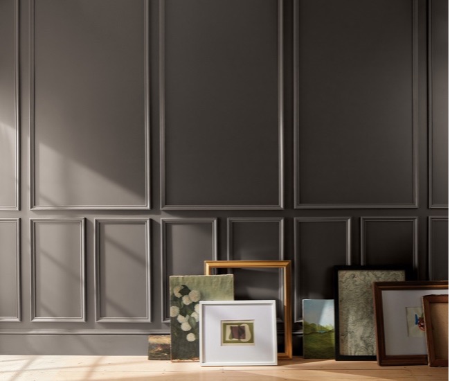
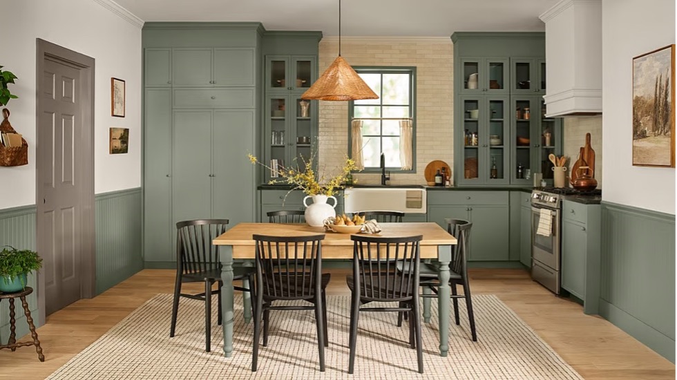
A softer color direction could be good news for real estate—a trend echoed by Sherwin Williams’ “Universal Khaki” and C2’s “Epernay” among its 2026 color picks. After several years of color-drenched interiors—from pinks and purples to deep blacks and moody hues—many home stagers and real estate agents may view a return of more neutral palettes as reliable crowd-pleasers. Shades of white on walls, kitchens and trim can create a “move-in ready” look that helps buyers imagine their own style in a space, without being distracted by bold colors splashed everywhere.
Pantone notes that Cloud Dancer can simplify spaces and create areas that feel relaxed and offer a sense of openness. The shade can add a spa-like calmness to bathrooms, a sense of spaciousness to kitchens and a clean backdrop for natural textures or statement décor, the paint firm says. Richer tones can then be layered in through accents, like pillows, artwork and accessories.
How It Fits Within Broader Paint Trends for 2026
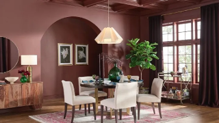
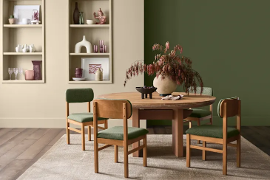
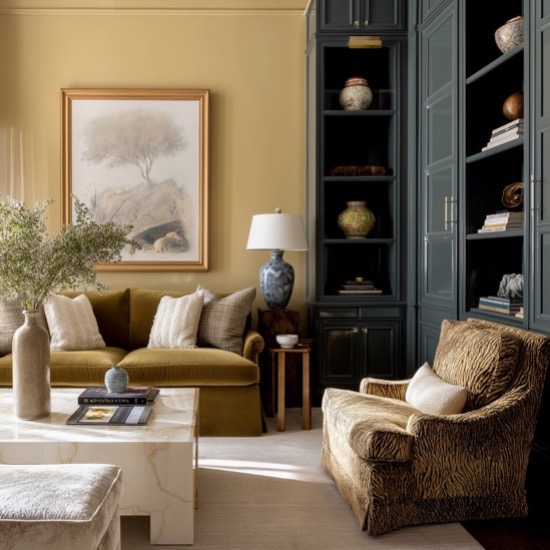
Across the industry, more paint companies appear to be favoring warmer neutrals and earthy tones for 2026—colors that emphasize comfort and approachability. But plenty of bolder pops of color are also getting mixed in.
Here’s a look at the range of 2026 Color of the Year choices, so far, from the leading paint firms:
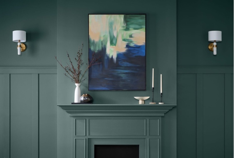
Benjamin Moore: Silhouette
Glidden: Warm Mahogany
Sherwin-Williams and HGTV Home: Universal Khaki
C2 Paint: Epernay
Valspar: Warm Eucalyptus
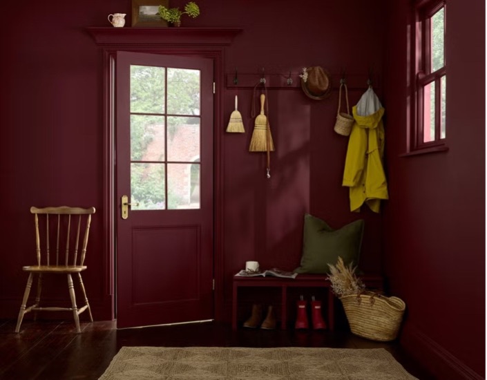
Graham & Brown: Divine Damson
Behr: Hidden Gem
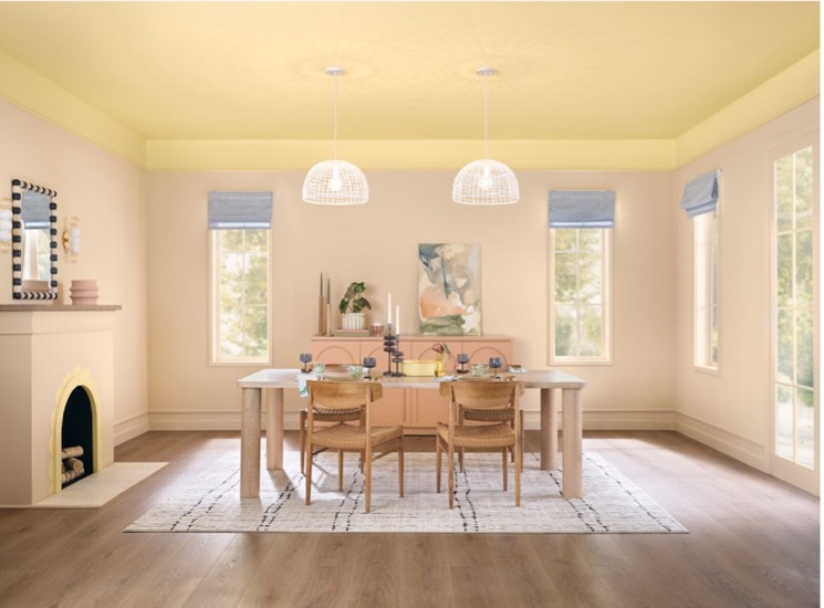
Dutch Boy Paints: Melodious Ivory

Be the first to comment